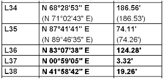
A fellow employee sends me a PDF showing a line table that was created using text objects with Arial and ArialBold font styles (both are True Type Fonts). The line table was created in two parts, then copy/pasted together into one table. Here's a portion of the result:

Notice that the Bold text in the first two lines (L34 and L35) is not as dark or thick as the bold text in the bottom three lines (L36, L37, and L38)? We tried using match properties to get the text to match, but the result is the same. That's unacceptable, right?
So here's the secret: The text on the bottom three lines (L36, L37, and L38) is at an elevation of -1.375 and the text on the top two lines (L34 and L35) is at an elevation of 0.
So the next time you are having issues with true type text, check the elevation of the text and maybe this will solve your problem.